In the end of October I attended the border:none conference 2023 and saw the great talk "Do we have to reinvent the wheel?" by Vasilis van Gemert. He used the phrase The UX of HTML to describe how semantically correct markup can significantly improve the user experience.
I found the term so catchy and convincing that I decided to borrow it and give a presentation of the same name to our developers to convince them to pay more attention to correct semantics.
He probably already had his article for the HTMhell advent calendar in the pipeline and that's why he used the term, but my romantic self would like to think that his own phrase struck a similar chord with him as with me and that's why there is now this outstanding article.
I probably should have called my article something else, but I think (like Vasilis too) that the title is really memorable and it's better to lure people into semantics by giving them a catchy phrase than to drive them away by talking directly about "boring" semantics. So I just hope Vasilis will forgive me and tacitly approves the title.
It's best if you take the time to read Vasilis piece before you continue reading here, because this article ultimately describes the same thing. However, as I probably can't put it into words as well as Vasilis, I would like to focus on the examples that I have prepared for my lecture, because sometimes a picture tells more than 1000 words, as they say.
The UX of interaction elements
Links
I'll directly dive into one of Vasilis examples. Having e.g. a span element with an onclick event instead of a proper link.
<span onclick="window.location.href='#'">a span with an onclick event</span>Compared to
<a href="#">a proper link</a>So you could think, there is already a much better developer experience with the link and that only adds up if you style the mouse cursor, the colour and more to really look like the link, but in a world of JS frameworks it's still not an uncommon sight.
So now try to right-click those elements.
a span with an onclick event and a proper link
Depending on your browser you will get something like this for the span

and something like that for the link
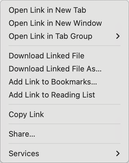
Of course, you can immediately see that the link is far superior. And while I can use a lot of styling and JavaScript, Aria labels and more to ensure that the "fake" link looks and essentially works like the real thing, I can't fake this right-click menu.
And here we haven't even talked about the impact on accessibility. The span element does not receive a focus with the tab key and it also does not appear in a screen readers list of all links etc.
Checkbox
The link is maybe the most impressive example, but the general rule of having the best UX with the semantically correct elements applies to many other cases too. So is a proper button superior to a button styled div and even a correct heading hierarchy can be a huge improvement.
One of Vasilis other examples is a checkbox.
<label>Label</label> <input type="checkbox" />
Notice how you can only click the checkbox itself. But when you ad the correct semantics to it ...
<label for="check">Label</label> <input type="checkbox" id="check" />... you can also click the label to check and uncheck. Also with that little change you make the element much more accessible again. When focusing the checkbox, the screen reader will read out the label's content.
The UX of forms
A checkbox is part of a form most of the time and you can gain an astonishing amount by using correct semantics in forms. But I didn't want to talk about semantics anymore, so I'd better talk about the UX of forms.
You can save yourself time-consuming validations if you give the inputs the right type and use the required attribute.
<form action="#">
<p><label>Name:</label><br><input type="text" required></p>
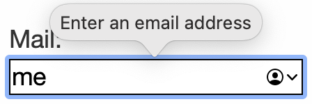
<p><label>Mail:</label><br><input type="email" required></p>
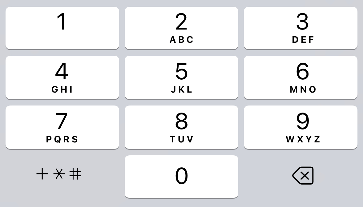
<p><label>Phone:</label><br><input type="tel" required></p>
<p><button type="submit">Submit</button></p>
</form>So if you click submit on this empty form, you get some useful warnings what to do and even the mail address is checked on probability, all without JavaScript.
But while you can probably create a nicer and even more useful validation with JS there again is more and again it's not reproducable in another way.
Open this page on your phone and notice how your keyboard changes between fields. While you have your normal keyboard with the name field, your keyboard adds an @ and a dot with the mail field and with the phone field your keyboard changes to a numerical input.
I would call that a major UX gain.
What's more?
There are probably a lot more elements that give you a behaviour out of the box, that you might have thought is only possible with the help of JavaScript. Like building kind of accordions with the details element.
Details
Your initially hidden content.Or a full pop up without any JS by the popover API.
My popover content
Or having really responsive images with the picture element and it's srcset and media attributes.
In the end it's really worth to say goodbye to your (hopefully not to thick) div-soup and use the semantics of HTML to really facilitate it's UX.
To get more people into that, try to stop boring with semantics and start talking about the UX of HTML.