Case Study
forstmaschinenzentrum.de
A twelve-year success story
In 2009, the client asked me to create a website for him.
His current situation was that he was a small used forestry machines dealer selling on the major platforms (Mascus, agriaffaires, autoline and technikboerse) and he was also an exclusive dealer for a manufacturer of harvesting equipment.
We quickly came to the conclusion that he wanted more.
To sell on his own site and become a trusted brand for used machines.
We defined a goal.
to be perceived as the most reliable source for well-maintained and reconditioned used forest machines.
Branding
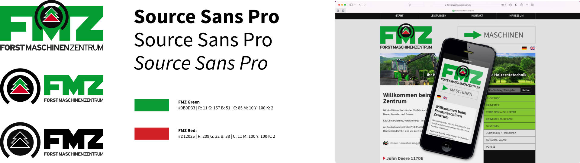
The first step was to give the company a look. With an incredibly long word like Forstmaschinenzentrum, it soon became clear that we had to go for FMZ, but as fmz.de and fmz.com were already taken, and forstmachinenzentrum.de was already established, it should be a combination of the abbreviation for good legibility and the full word. I also wanted a strong image to mark all the machines they sold.
Web design
The content of the website could be divided into machines, products (the aggregates) and services (insurance packages etc.). As there was no previous usage data available, we blindly assumed that the usual visitor would use the site on an office desktop. Often an old one (IE6 and earlier). So the first design focused on working on old machines and prehistoric browsers.
First redesign
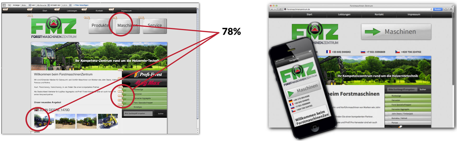
After just over two years, we looked at the data from Google Analytics. It showed that users' computers seemed to be much more modern than we thought. Mobile was only 10% at the time, but growing fast. More than 75% of the interactions on the landing page led to the machinery page, and almost all of the visitors via Google search came for machinery related terms. As the overall business became less interesting, we decided to enforce this behaviour. Instead of the three large direct link buttons, we decided to have just one button leading to the machines page.
Multilingual
Around 2015 my client wanted to have the site in multiple languages. As the CMS used was Textpattern, I implemented this using MLP. But while translating the ever-changing machine catalogue into English and French worked (at least for a short while), Czech, Polish, Finnish and Russian never got enough attention.
Analytics showed that the content structure was still working. Mobile visitors were up to just over ⅓, everything was developing as expected, so I used this technical rebuild just for some style refinements.
DSGVO cripples analytics
In 2020, the client decided not to have a cookie consent pop up because of the new European privacy rules (DSGVO). So they asked me to turn off analytics instead of having that pop up. I approached the client to put the Google Analytics data to good use and do a complete relaunch.
Insights
Almost half of the visits are from mobile devices, probably even more from touch devices. That's really low compared to other sites, but it was always assumed that forstmaschinenzentrum.de is visited in an office most of the time.
The machine catalogue is mostly browsed by type.
I had the opportunity to interview two of FMZ's long-term customers and also FMZ's sales people. These insights and the analysis data gave me the following problems.
- Some larger customers only have red (green, yellow) fleets and only want to search for Komatsu (John Deere, Ponsse) machines.
- On mobile phones, it is difficult to browse by machine type or brand because the navigation is hidden under the content on small screens.
- Often a new machine is financed by selling the old one. People are afraid of not selling their old machine.
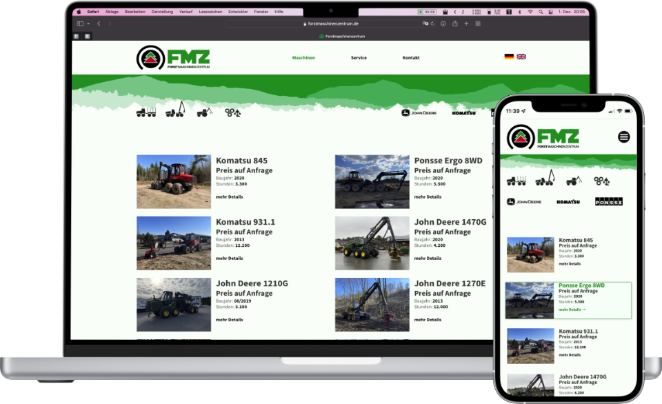
I created a set of icons for selecting machine types. This navigation and also the brand navigation will now always stay on top. To make the machine catalogue a bit more touch friendly, I defined the whole machine as a button in the list view.
The general look has been given a modern refinement. The key image was replaced with an abstract landscape to give the site a frame without taking up too much space.
To help customers who are afraid of not selling their old machine properly, we formalised a service to help them and featured it on the home page.
Unfortunately, the multi-language plugin has become obsolete. But I've found a solution that's just as easy for the customer to use and doesn't rely on a plugin. So no more blocking the upgrade path of the CMS (as happened with the old one).
With a little more thinning out in the general site architecture, it should now be ready for another ten years.
Summary
In the end, I'm really happy with the result. And so is the client. Not only because of, but with the help of my work, he is now one of Europe's biggest sellers of used forestry machines.